DESIGN SYSTEM

Built to improve

growth

discovery

growth

landing

conversion

with NinjaKit.

DESIGN SYSTEM

Built to improve

growth

discovery

growth

landing

conversion

with NinjaKit.

DESIGN SYSTEM

Built to improve

growth

discovery

growth

landing

conversion

with NinjaKit.

DESIGN SYSTEM

Built to improve

growth

discovery

growth

landing

conversion

with NinjaKit.

Overview

Ninja Kit is a focused and flexible design system created to support the Coding Ninjas Growth Pod. Built to drive clarity, consistency, and impact, it streamlines the design of key user journeys across landing pages, product pages, checkouts, and navigation.


Inspired by Coding Ninjas’ bold and energetic identity, Ninja Kit embraces vibrant colors like Marigold, Electric, and Taxi to evoke energy and action. Neutral tones such as Ebony, Walnut, and Porcelain provide balance, ensuring clear visual hierarchy and improved readability. Sentiment colors like Basil, Pomegranate, and Mellow add warmth and personality, giving designers flexibility to convey emotion effectively.


Ninja Kit was built to empower rapid experimentation and growth-driven designs while ensuring a cohesive and delightful user experience.

Ninja Kit is a focused and flexible design system created to support the Coding Ninjas Growth Pod. Built to drive clarity, consistency, and impact, it streamlines the design of key user journeys across landing pages, product pages, checkouts, and navigation.


Inspired by Coding Ninjas’ bold and energetic identity, Ninja Kit embraces vibrant colors like Marigold, Electric, and Taxi to evoke energy and action. Neutral tones such as Ebony, Walnut, and Porcelain provide balance, ensuring clear visual hierarchy and improved readability. Sentiment colors like Basil, Pomegranate, and Mellow add warmth and personality, giving designers flexibility to convey emotion effectively.


Ninja Kit was built to empower rapid experimentation and growth-driven designs while ensuring a cohesive and delightful user experience.

Color System

Brand

A bold and energetic hue that embodies the spirit of Coding Ninjas. It’s designed to grab attention, evoke warmth, and reinforce the brand’s confident and dynamic personality.

Marigold

#FB6514

Primary

A bold and vibrant palette that balances energy with clarity. These colors are designed to draw attention, enhance engagement, and create a sense of dynamism throughout the experience.

Electric

#0062EF

Wisteria

#6666CC

Marigold

#FB6514

Taxi

#FFCE00

Surface/strokes

A grounded palette of rich, earthy tones and soft neutrals that provide depth, structure, and balance. These colors ensure content remains clear and visually organized.

Ebony

#281E16

Espresso

#433427

Walnut

#AC9E88

Sand

#D3CEC4

Porcelain

#FFCE00

Flour

#EFECE6

Pearl

#FAF9F7

Salt

#FFFFFF

Natural greys/text

A versatile range of neutral shades that offer balance, readability, and subtle contrast, ensuring UI elements feel clean, modern, and easy to navigate.

Ash600

#000000

Ash500

#6C6865

Ash400

#BDBBB9

Ash300

#DEDDDC

Ash200

#F2F2F2

Ash100

#F7F7F7

Denim100

#394871

Sentiment colors

A set of functional hues designed to convey feedback and status. From success and warnings to errors and information, these colors ensure clear communication and guide user actions effectively.

Surface/Basil

#EFFCF1

Basil

#3D834F

Surface/Pomegranate

#FFF0ED

Pomegranate

#AE2C33

Surface/Mellow

#FFF9EB

Mellow

#CAA53D

Typography

Typography — Our type system is built around Mulish, a versatile and modern font that combines readability with a clean, professional aesthetic. We love Mulish for its balanced letterforms, making it ideal for both content-heavy pages and impactful headlines. With font sizes ranging from 11px to 44px, our typography system ensures flexibility across diverse layouts while maintaining clarity and visual harmony.

Typography — Our type system is built around Mulish, a versatile and modern font that combines readability with a clean, professional aesthetic. We love Mulish for its balanced letterforms, making it ideal for both content-heavy pages and impactful headlines. With font sizes ranging from 11px to 44px, our typography system ensures flexibility across diverse layouts while maintaining clarity and visual harmony.

Type scale

Size

Weight

Line

H1 / 44 Bold

44

Extra Bold

60

H2 / 32 Bold

32

Extra Bold

42

Title / 24 Extra bold

24

Extra Bold

30

Title / 20 Bold

20

Bold

26

Heading / 18 Bold

18

Bold

23

Heading / 16 Bold

16

Bold

20

Body / 14 Bold

14

Bold

18

Body / 14 Semi Bold

14

Semi Bold

18

Body / 14 Regular

14

Regular

18

Label / 12 Bold

12

Bold

15

Label / 12 Semi Bold

12

Semi Bold

15

Label / 12 Regular

12

Regular

15

Label / 11 Bold

11

Bold

14

Label / 11 Semi Bold

11

Semi Bold

14

Label / 11 Regular

11

Regular

14

Grids and spacing

The design layout is optimized for multiple resolutions, including 1240px, 1024px, 768px, and 320px, ensuring a seamless experience across different devices. At higher resolutions like 1280px and 1024px, the grid expands with wider content areas and increased spacing to enhance readability and visual clarity. For mid-sized resolutions such as 768px, the layout condenses slightly, maintaining structure while reducing excessive whitespace. At the smallest resolution of 320px, the grid simplifies significantly, ensuring content remains accessible and easy to navigate. Throughout these breakpoints, spacing follows a consistent multiple-of-4 system (e.g., 4px, 8px, 16px, 32px), maintaining harmony and visual balance.

The design layout is optimized for multiple resolutions, including 1240px, 1024px, 768px, and 320px, ensuring a seamless experience across different devices. At higher resolutions like 1280px and 1024px, the grid expands with wider content areas and increased spacing to enhance readability and visual clarity. For mid-sized resolutions such as 768px, the layout condenses slightly, maintaining structure while reducing excessive whitespace. At the smallest resolution of 320px, the grid simplifies significantly, ensuring content remains accessible and easy to navigate. Throughout these breakpoints, spacing follows a consistent multiple-of-4 system (e.g., 4px, 8px, 16px, 32px), maintaining harmony and visual balance.

1240

1024

768

320

Buttons

The Ninja Kit CTA system is designed for clarity and impact. With a vibrant primary button, flexible secondary options, and subtle text links, each style ensures clear visibility and intuitive interactions. Balanced contrast and thoughtful spacing keep the design clean and user-focused.

The Ninja Kit CTA system is designed for clarity and impact. With a vibrant primary button, flexible secondary options, and subtle text links, each style ensures clear visibility and intuitive interactions. Balanced contrast and thoughtful spacing keep the design clean and user-focused.

Primary

Small

Medium

Large

Secondary

Small

Medium

Large

Secondary (Inverted)

Small

Medium

Large

Textual + icon (Grey/Orange)

Click here

Call to action

Call to action

Call to action

Input fields

Our input fields are designed for clarity and ease of use. Each field includes clear labels, placeholder text for guidance, and supporting messages for additional context. Different states like focus, error, and warning are distinctly styled to provide immediate feedback. This ensures users can confidently enter information while staying informed about any required actions or corrections.

Our input fields are designed for clarity and ease of use. Each field includes clear labels, placeholder text for guidance, and supporting messages for additional context. Different states like focus, error, and warning are distinctly styled to provide immediate feedback. This ensures users can confidently enter information while staying informed about any required actions or corrections.

Default

Label

Placeholder field

Help text /Message

Focus

Label

Placeholder field

Help text /Message

Filled

Label

Placeholder field

Help text /Message

Error

Label

Placeholder field

Error text/ Message

Warning

Label

Placeholder field

Warning text/ Message

Disabled

Label

Placeholder field

Warning text/ Message

Icons

Icon Noir

Our icons are from Icon Noir, offering a clean, consistent style with balanced line weights. They add clear visual cues, enhancing usability without distraction.

Illustrations


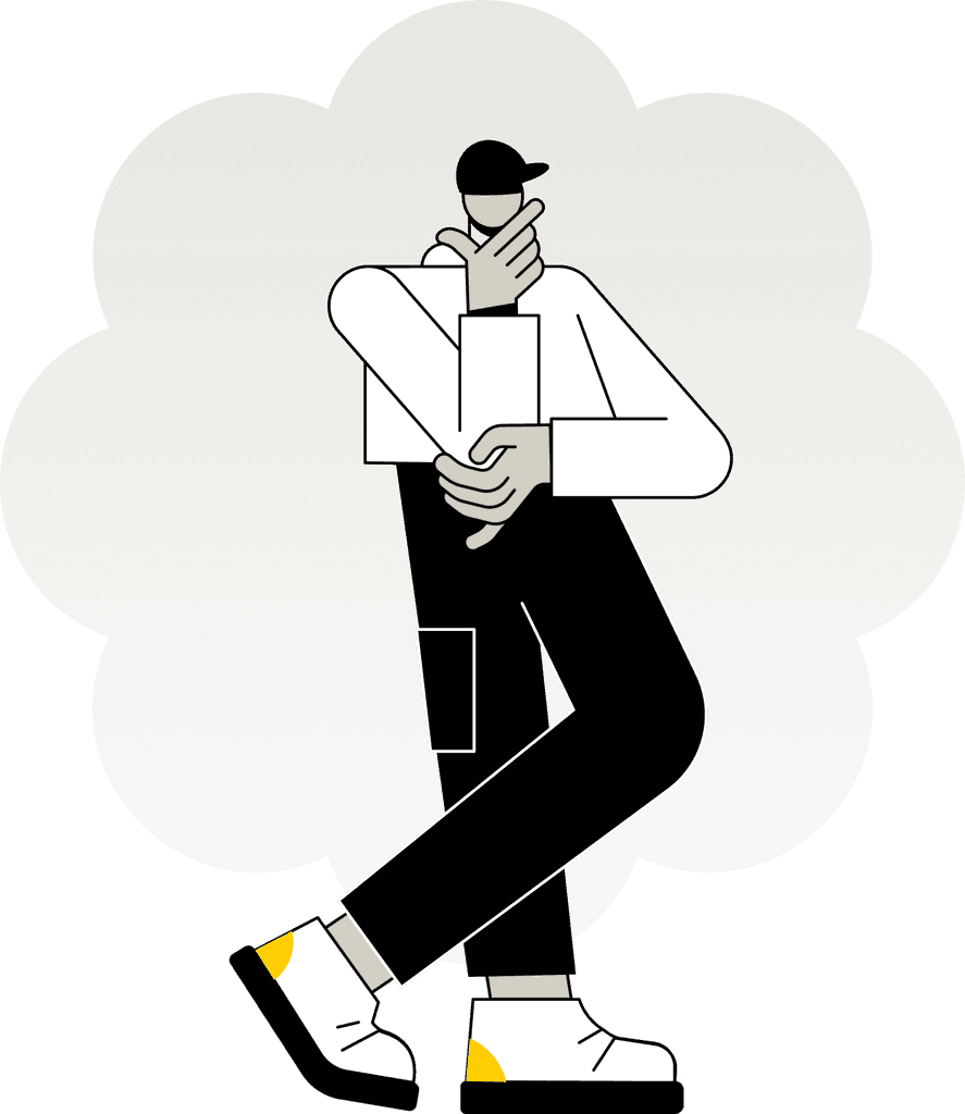
The illustration combines playful geometric shapes in bold colors with a clean, monochromatic figure. The vibrant patterns add energy, while the thoughtful character balances the design with focus and calm. Pops of yellow connect both elements, ensuring visual harmony.
Create a free website with Framer, the website builder loved by startups, designers and agencies.